Slack has recently been all over the news for being acquired by Salesforce for $28Bn. Slack came out as a messiah in the world of workplace communications which was dominated for decades by the giants like Microsoft (Lync, Skype, Outlook, Teams) and Google (Hangout, Meet). Slack’s simpler user experience has had a very important role to play in the exponential growth that it had seen over the years. But, was it really the great user experience of Slack or really bad user experience of competitor products that drove this growth. Now, with the Salesforce acquisition, Slack has entered the big boys club and it is expected to explode in scale. And, with great scale comes great scrutiny and criticism. So, let’s dig deep and tear down the Slack user experience (UX) design.

What doesn’t work for Slack UX design?
1. Poor “thread” experience
While replying to a message in Slack, the reply goes out as a thread to that specific message. I guess the product intention here is to keep the channel clean and the conversation limited to only concerned stakeholders. And theoretically, this is the right design. In an ideal world, all the conversation related to that topic should have been part of that thread and it would have been great. But do we live in an ideal world? The product is expecting the users to behave in an organized fashion which is not really the case. The whole design falls apart when –
- Sometimes you miss out on the replies because the replies are not visible upfront in the channel. Though there is an option of “share in channel” but that’s unchecked by default.
- Often the thread ends up as a mini channel in itself.
- People would discuss other non-related topics as well in a thread. Thus, defeating the whole purpose of a thread.
- 2 of the 5 people would reply in threads and 3 of them would reply as a separate message in the channel. Thus, messing up the whole information flow.
I personally think a WhatsApp like conversation flow would have been much simpler where every message is a message to the entire channel, but you have the ability to quote a message to indicate a continuous conversation.
2. Super complex way of managing conversations
To manage my conversations in Slack, I have to keep track of 4 different sections –
1. DMs
These are direct 1:1 message to me. This is fine.
2. Mentions & Reactions
Messages addressed to me in different channels. If you think about it, this is not very different from DMs.
3. Threads
For threaded replies in any of the channels I am a part of. Why do I need this? First you created a problem by making your threads super complex to use (as mentioned in above point) and then you try to create a solution to that problem by having a separate section for threads.
4. Channels and Direct messages list in Sidebar
For messages in my channels which are not directly addressed to me. This is also fine.
Here is what I think Slack can do to simplify the user experience (UX) –
- “DMs” and “Mentions & Reactions” can be clubbed together as these are the messages which require an immediate response from me. The only difference between them is that one is 1:1 conversation and another one is a channel but my action to both of them is gonna be pretty much similar. That is, to respond to the message i am tagged in.
- “Threads” section can be removed as it doesn’t really serve any purpose. Fix the thread experience and you won’t need it anymore
- “Channels and Direct messages list in Sidebar” should remain as is.
So, I’ll have just 2 sections for my messages – one for messages which are addressed directly to me and another for messages sent to the channel. Simple.
3. Poor “Search” experience
Slack’s search experience is poor, very poor. By default, the search is always global search (and includes results from even the channels that I’m not part of). There is no easy way for me to search through a channel or DM history. The only way to do a refined search is to manually enter those command like “in:@xyz”, “from:@abc” etc.
Just give me a simple search box and if I am in a DM then search through that DM and if I’m in a channel then search through that channel.
Why do I have to explicitly call this out? It’s pretty much the standard search behavior in all the platforms. Again, learn something from WhatsApp. Please.
4. Ability to edit a message
This is a tricky one and I know that many people view it as an advantage of Slack that you can go back and edit your messages. Though it has its advantages in case of spelling, grammatical errors, accidental messages to wrong channel, there is one big problem with edit functionality in Slack.
The primary use case for Slack right now (and possibly for the foreseeable future) is “workplace communication”. If I have sent a message to a colleague regarding some important work-related thing, then I should be accountable for it. Believe it or not, people are not very organized, and strategies are made on the fly in Slack channels, client pricing is discussed on these channels etc. And often, these Slack messages are the only documentation (or logs) of such conversations. I should have no option to go back and edit / delete my response.
With edit as an option, what it effectively means is that, I can’t rely on the authenticity or credibility of Slack messages and have to end up taking screenshots from time to time. Nobody likes that.
Again, I think the UX should be simple and similar to WhatsApp – you send a message and it’s done, you can’t undo it. The best you can do is delete it within few minutes while it is fresh in everyone’s memory. For Slack, since we are in an official setup, I think even the time bound delete should not be there at all.
Now, if at all, Slack and the users strongly believe that edit feature should be there, then there has to be a good UX to see the history of the edited messages. I think Atlassian does a pretty good job in this respect with JIRA. Even a single character change in the description of a ticket has a log.
5. Poor “Sections” experience in the mobile app
Slack has this really cool feature creating “Sections” in channels so that I can put all the similar or related channels in one place. However, there are a few gaps when it comes to using sections in the mobile app.
a. Can’t create sections in the mobile app
For some weird reason I just can’t create a new section using Slack Android mobile app (assuming it’s the same in iOS app as well). We had a similar observation about Gmail not allowing to create “labels” through their mobile app when we did Gmail UX review.
What is it with grouping things in the mobile apps that is so difficult? Are we missing anything here? Please do let us know in the comments if there is any logic behind this.
b. Can’t collapse sections in the mobile app
We can’t collapse a section in Slack’s mobile App. The collapse works perfectly fine in their desktop app.
c. Broken sections in the mobile app
The whole point of sections was that I want to keep similar or related channels together. But, in their mobile app, Slack breaks down the sections depending upon read/unread messages.
- It first shows all the channels with unread messages grouped by their section and then
- It has a section of “Everything else” which show the channels with no unread messages again grouped by sections.
Why over design and make it complex?
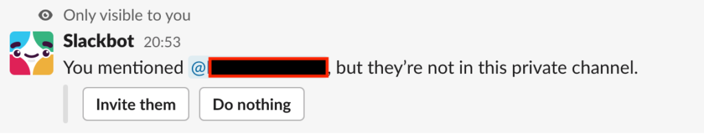
6. Ability to tag non-members in a Slack channel
I am able to tag almost anyone in a message who is part of the same workgroup. Why? I should only be able to tag the members of the channel. Again, it should be like WhatsApp and typing “@” should show only the members of the channel.
Though you get a message later on saying that the recipient is not in the channel but it’s too late now and you have already embarrassed yourself by tagging the wrong person. Also, the message come too late and is not real time.
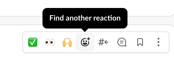
7. Default emoji reactions of “Thumbs up” and “Smiling face” are not available upfront
I may be generalizing here a bit, but I think “Thumbs up” and “Smiling face” are the two most commonly used emoji response in an office setup. Your team completed a task on time, here’s a thumbs up. You agree with a certain message, here’s a thumbs up. You wanna nod to a casual joke by a colleague, here’s a smiling face. But, in Slack, these 2 responses are buried inside the “Find another reaction” submenu. The ones available upfront are – “Completed”, “Taking a look”, “Nicely done”. I have never used them even once on any messaging platform in my entire life.
Here is what I think Slack can do simplify the user experience –
- Analyze the data across all the users and figure out the 3 most commonly used emoji and show them upfront. If “Completed”, “Taking a look”, “Nicely done” are indeed the top 3 used emojis across all Slack users then my bad and what the hell is wrong with you guys?
- Customize it at the user level and show the user’s 3 most used emojis upfront. They are in fact doing it already, but it’s still buried inside the “Find another reaction” submenu. Just bring it outside so that I can use my favorite emojis with just one click.
8. The “Return to recent” fiasco
In their mobile app, clicking on a message in “@Mentions” takes me to the respective channel but I have to click on “Return to recent” if now I want to message on this channel. Really weird. Why can’t it just be a simple redirection to that channel with a focus on the concerned message?
9. No Tabs
Slack positions itself as an alternative to email. They even have a whole page dedicated on their website to explain why Slack is better than email? Although, I think they are way beyond email already. They are competing with WhatsApp, Skype/Teams, Google Hangout etc.
However, one thing where email still beats Slack user experience is the ability to have multiple tabs open simultaneously. It would really help if I can have multiple channels / DMs open at the same time so that I can refer them together rather than continuously switch from one channel to another. It may appear counter-productive at first but that’s just how people are. We all are productive in our own messy little ways. Again, we made a similar comment about Gmail not allowing us to open emails in a new tab in our Gmail UX review.
Okay, enough ranting. There are also some things Slack is pretty good at. Salesforce didn’t pay all that money for nothing.
What works for Slack UX design?
1. Getting all the channel history on being added to a channel.
When someone gets added to a channel, they get access to all the previous messages in that channel as well. This is extremely useful in the workplace setup as people get added to conversations on a need basis and not always at the time of channel creation. Thus, it helps you get a proper context on the conversations.
This is a big problem with WhatsApp groups where you get added to a group, but you have no context of the previous messages in that group.
2. Doesn’t eats up your phone storage
We get thousands of messages on Slack and since all of it is maintained in cloud, our phone storage is not consumed that much. This again is one of the biggest advantages Slack has over WhatsApp, which has now earned a lot of bad rep for eating up a significant chunk of your phone storage.
Now, we understand that WhatsApp stores all the messages in your device to make it secure and fast, but that leads to the above problems. And as a user I really don’t care about the tech implementation, this is a pain point and Slack does a better job at solving it.
3. Creating quick temporary group conversation
Often, we need to have a quick discussion with multiple people. Now, we shouldn’t use channels as this is supposed to be a temporary one-time conversation. Also, we can’t use DM as DMs are 1:1.
Creating such temp discussion groups in Slack is super easy. It’s as easy as typing names in the “To” list of an email. Though the same can be done in other platforms (like WhatsApp, Skype) as well, their UX is just not that great.
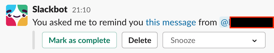
4. “Remind a message” feature
This is a really cool feature. I can set reminder to individual messages so that I can be reminded to act upon it. This can act as a mini calendar / to do list. However, the reminder comes as a message from Slackbot and we tend to ignore most of the messages from Slackbot. Still, something is better than nothing.
5. Notification sound
The default “Knock Brush” notification sound in the Slack desktop client is just a user experience delight. It’s so unique and it just makes you want to check your messages instantly. I understand that it may just be a personal preference and others may not like it, but I am yet to meet anyone who is annoyed by that sound.
Agree / Disagree with the above list? Have anything to add? Let us know your thoughts on the Slack user experience in the comments or through our social media.