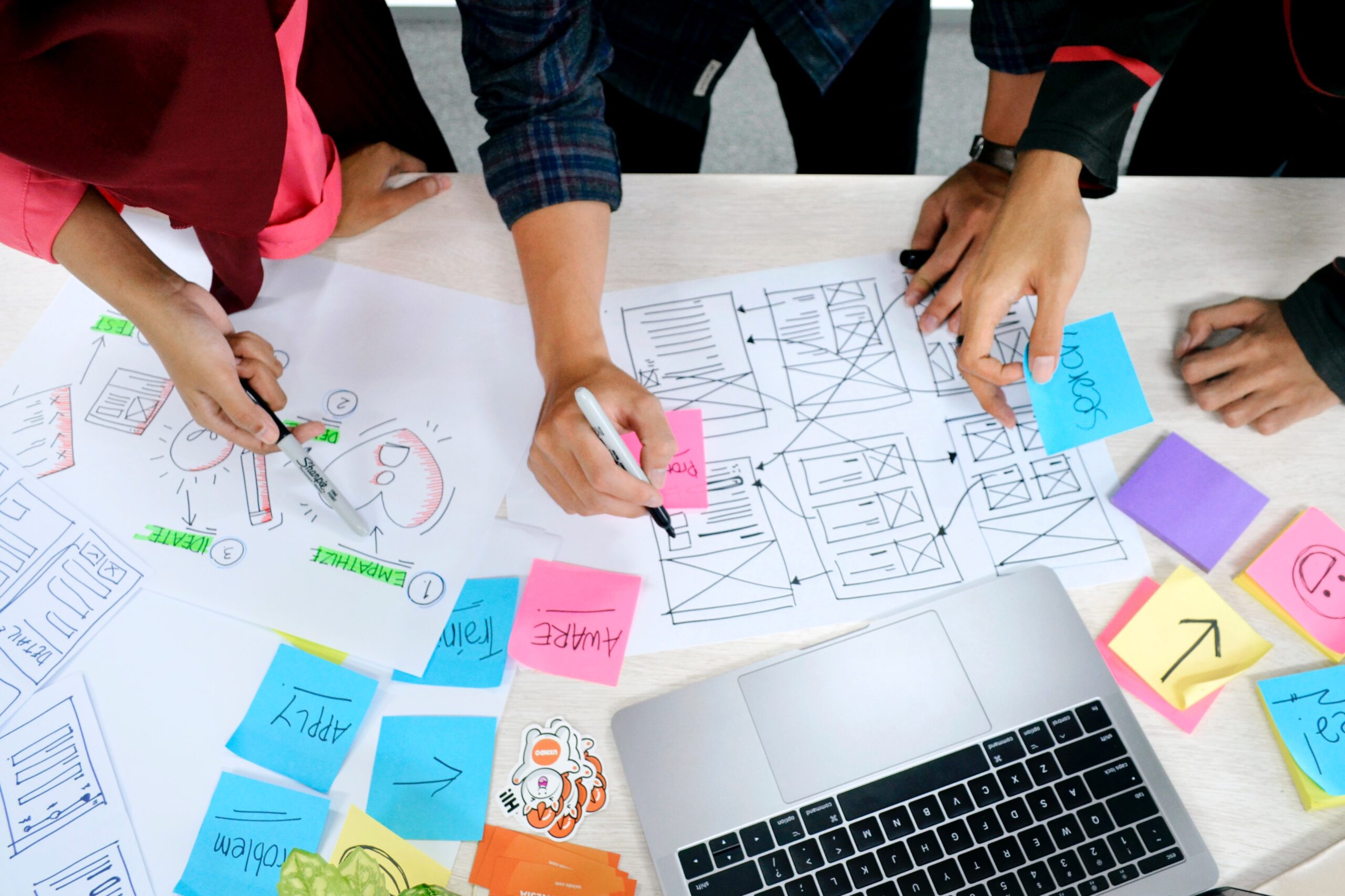
With over 700 million users and monthly active users (MAU) of over 300 million, LinkedIn is one of the top social media platforms. In today’s world of social media overload, LinkedIn has been able to carve a unique niche for itself in the form of “networking for professionals”. However, LinkedIn’s user experience (UX) has not evolved much over the years and LinkedIn has been winning primarily because of lack of decent competition. If LinkedIn focus more on its UX game, will it be able to better tackle the growing competition from Indeed, Glassdoor and other similar platforms? Will it be able to drive more engagement and user growth? Let’s discuss the top 8 user experience (UX) design that LinkedIn does wrong.
1. Old School Web layout
LinkedIn’s web page can be broken down into 4 major components –
- Left Sidebar – Covers 15% of the page width. Shows brief profile snapshot, pages you manage and hashtags you follow.
- Feed – Covers ~38% of the page width. Shows posts, photos, videos, ads etc.
- Right Sidebar – Covers ~22% of the page width. Shows LinkedIn news, trending courses and ads.
- Borders and empty space between containers – Covers 25% of the page width.
The “Feed” is the most important part of the page and it covers just a little over one-third of the page. Moreover, a quarter of the page is just blank. That, I think, is a great wastage of a really expensive real estate. We made a similar comment about Facebook’s Web UX sometime back and surprisingly, with the revised layout, Facebook now devotes ~50% of the page width to the feed.
2. Not able to add multiple stories in one go
LinkedIn recently copied the “Stories” from Snapchat / Instagram. No shame in that, WhatsApp and Twitter also did that. But if you are copying something at least do it properly. How hard can it be to support a simple feature of uploading multiple images in one go? Right now, users have to add one story at a time and that’s highly annoying. Surprisingly, Twitter also does the same mistake in their version of stories aka “Fleets”.
3. Not able to save drafts
Gone are the days when social media posts were impulse, in the moment updates. Nowadays, if you are serious about social media, there is a good amount of thought that goes behind every single post. And thus, the ability to save drafts is an absolute must. But LinkedIn being LinkedIn, just totally ignores it.
- In LinkedIn app, you can just save the last post as a draft and that too as an individual. If you are interacting as a page, then you can’t even draft save the last post.
- In LinkedIn web, a user can’t save any draft at all.
4. The Add Photo / Take Video disaster
While uploading media, LinkedIn gives 2 explicit CTAs – “Add a Photo” & “Take a Video”. There are 2 main problems here –
- Majority of the social media platforms have a single CTA for media upload and then from there they provide options to smoothly switch between photos, videos and camera. It’s just more intuitive that way.
- Even if LinkedIn felt strongly about having 2 separate CTAs, it should have been on the basis of “phone storage” and “camera” (the way Twitter does it). But, this is what LinkedIn decided to go ahead with –
- Add a photo – Allows you to upload photos only from your phone storage. If you want to click a picture form your camera, then there is no way to do that. You have to go back and select the “Take a video” option to enable your phone camera.
- Take a video – Gives you nice options to switch between Video Camera, Still Camera and phone storage. However, in this option, phone storage is only able to access the video files and not photos.
It just increases the cognitive overload and leads to too much back and forth in terms of switching from one option to another. Very bad user experience from LinkedIn.
5. Toast messages don’t auto disappear in web
LinkedIn shows these nice toast messages in the bottom left of the page for scenarios like “Post Successful”, “Invitation sent” etc.
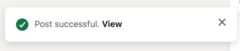
However, for some reason, they just stay there all the time unless explicitly closed. They persist even across page clicks. By definition, a toast message should auto disappear after some time. But hey, we are LinkedIn. We’ll force the user to manually close these messages. Super annoying.
6. No GIF support and video duration should be less that 3 seconds. Why LinkedIn why?
LinkedIn doesn’t let you post GIFs or videos less than 3 seconds. Such archaic validations may have made some sense in the pre GIF/short video era.
- GIFs and memes have taken over the internet in the past decade and we all love it. Facebook’s recent $400 million acquisition of Giphy just goes on to show the power of GIFs.
Also, GIFs as a format probably hasn’t fully standardized yet. Many online GIF creator platforms actually create GIFs as a 1-2 second video. And, LinkedIn doesn’t let you upload that. Why you do that LinkedIn? - For today’s TikTok crazy generation, short stories are a new age sensation. Though 3 seconds may not seem much but actually a lot of content can be shown in those 3 seconds. Heck, Instagram has a dedicated app for these 2-3 second videos – Boomerang, with over 100 million app downloads. And they came up with this 5 years back.
Come on LinkedIn, you seriously need to catch up with Gen Z.
7. Not able to freely engage as a “Page”
If you maintain your company’s page on LinkedIn, then there are no/limited engagement options you have on LinkedIn.
- In LinkedIn web, you get an option to follow just 3 hashtags and you can engage (like, comment) only with the posts with those hashtags. This greatly limits your ability to freely engage with all the content on the platform.
- In LinkedIn app, as a page, you cannot engage with others’ content at all. Not even for the hashtags your page follows.
8. Not showing the post’s share count
LinkedIn shows the like and comment count of a post but not the share count. Why?
Showing the share count for a content may nudge more people to share/engage with the content. For reference, as per stats, more than 50% of the tweets on Twitter are retweets. Again, LinkedIn missing out on a simple product fix that could lead to huge engagement and business impact.
9. Bonus – My Rants
In addition to the above points, there are few more small (and probably insignificant) observations that I have on LinkedIn user experience. Majority of the users may not even notice these things but they are very annoying once you start noticing them. So, here we go –
- Left facing “Like” icon. Like icon is intuitively always supposed to be right facing.
- Use of “green” color in the white and grey theme. Seems out of place.
- The active icon in the bottom tab bar changes slightly. Not sure of what purpose does it serve.
- No way to clear all notifications.
- “Green” colored clap icon. Hate that icon. This particular shade of green just makes it look like something virus/disease related. Just my point of view.
- Inconsistent “Gutter space” between cards. Gutter space on jobs page is different from the rest of the app.
- and the list goes on and on ….
Agree / Disagree? Were we too harsh? Did we miss anything? Let us know in the comments or through our social media.