With a total user base of 1.3 billion comprising of monthly active users (MAU) of 330 million and daily active users (DAU) of 145 million, Twitter is one of the top social media platforms. Twitter became a hit soon after it’s launch because it brought a radical shift in the content game. You no more need to write 1000s words long blogs/articles to get your point across and don’t need to worry about getting decent exposure. Twitter made everybody a content creator. However, user experience (UX) is not considered to be one of Twitter’s forte and one can say that Twitter is winning the game primarily on the basis of content and engagement. What if Twitter ups its UX game? Could it drive more engagement and user growth? Let’s discuss the top 9 user experience designs that Twitter does wrong.

1. “Followers” section shows a “Follows you” tag
When a user is in the “Followers” section, it’s obvious that everybody in the list follows the user. Duh!. There is no point in explicitly showing the “Follows you” tag next to each user. It unnecessarily clutters the space.
I think the reason for this is pure laziness, where Twitter decided to reuse the same container for showing the user info everywhere. It makes sense to show the “Follows you” tag in the “Following” section or in the “Feed” but definitely not in the “Followers” section.
2. “Promoted” tag at the bottom of the tweet
Twitter shows the “Promoted” tag in its ads at the very bottom.
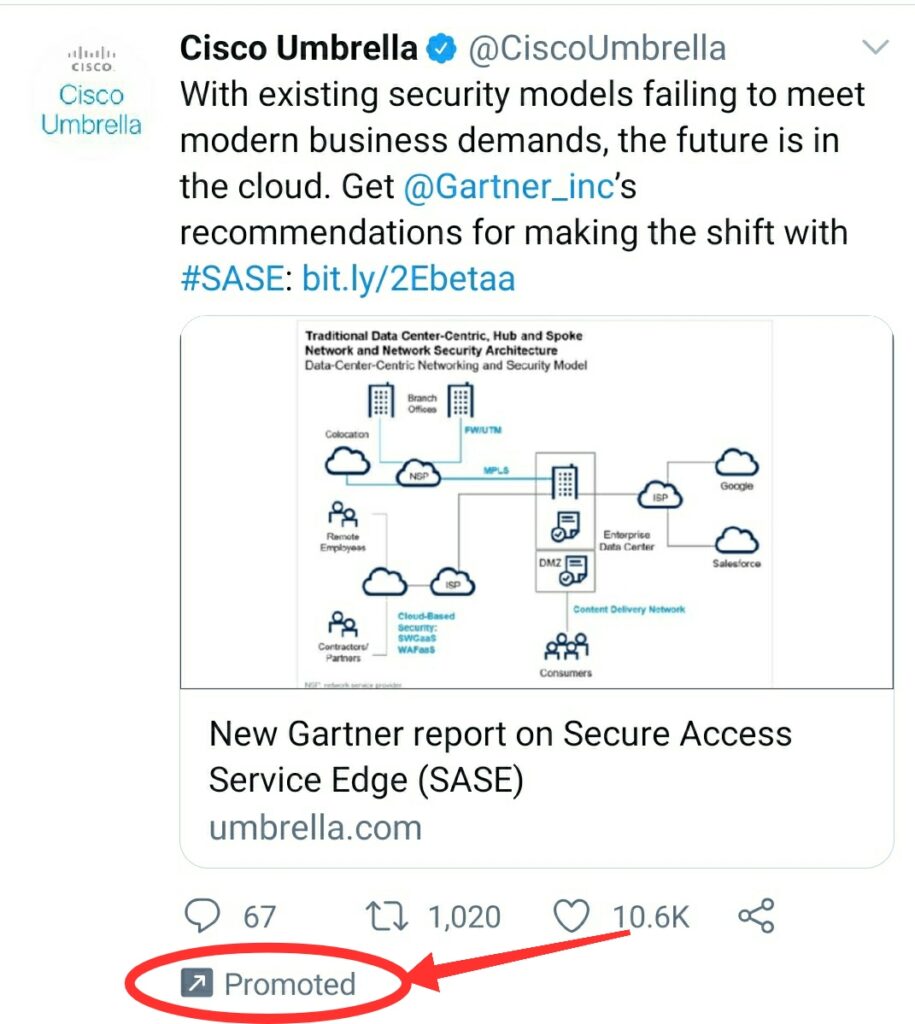
I have got nothing against the native ads but this is going a little too far in terms of disguising your ads as tweets. Also, the color of the tag is light grey which doesn’t make it look prominent enough.
On the other hand, when we compare it with other social media platforms, there doesn’t seem to be any hesitation with respect to calling an ad an ad. E.g. –
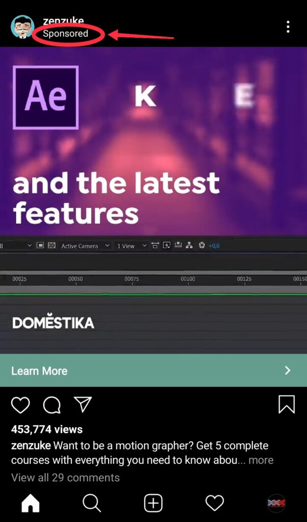
Facebook and Instagram native ads show a “Sponsored” tag right at the top.
Facebook Ad

Instagram Ad
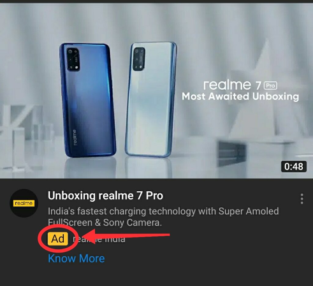
YouTube native ads have a clear border and a yellow colored “Ad” tag to make ads prominent enough and differentiate them from the normal feed.
YouTube Ad
Till the time a user doesn’t notice these things, it’s all good. But when they do, i think, it creates a negative impact on the trust a user has on the platform.
3. “Trending Arrow” direction
When you search for something on Twitter, then it also shows you the trending suggestions (just like any other social media platform).
Notice that the “trending arrow” is pointing towards the left. However, when one thinks of the “trending arrow”, subconsciously the first design that comes to mind has the arrow pointing right. A quick Google search of “trending arrow” confirms the same. All the top results have the arrow pointing to the right.
These things usually can’t be unseen once you notice them and annoy some users a little more than they ideally should. We had a similar observation about the Instagram ‘Comment’ icon.
4. “Bookmark” option buried in the “Share” icon
Twitter has its “bookmark” feature buried inside the “share” icon. This doesn’t make any sense as share and bookmark are two completely different features.
Like Facebook and LinkedIn, Twitter also could have easily put this option in the top right dropdown arrow as we have already been subconsciously programmed to click in the top right to save/bookmark a post.
Also, it would be nice to have a single click bookmark feature rather than 2 click UX that we have now.
5. Inconsistent “Share” icon on Twitter App and Web
“Share” icon has had many variations across various platforms. Below are some of the widely acceptable options –
Which icon to use is use as a share icon is pretty much the choice of the platform. However, whichever icon you choose, you should be consistent with it. Twitter, on the other hand, has for some reason decided to use different icons for the “Share” feature on web and app.
Twitter Web – Share Icon
Twitter App – Share Icon
For users who use the platfrom on both app and web, it is quite annoying and distracting.
6. No sync between drafts in App and Web
This is not just a UX issue, it’s a bug. Your drafts between app and web are not synchronised. Twitter seems to be maintaining separate drafts list on App and Web. So, if you saved a draft using your phone and now try to access it through your laptop, you just won’t be able to do it. I can’t think of any possible reason for why Twitter would intentionally do this.
This behaviour also points to a more serious backend issue. Is Twitter maintaining separate backend data for a user basis the front end platform? If yes, then i think that’s a very poor product design.
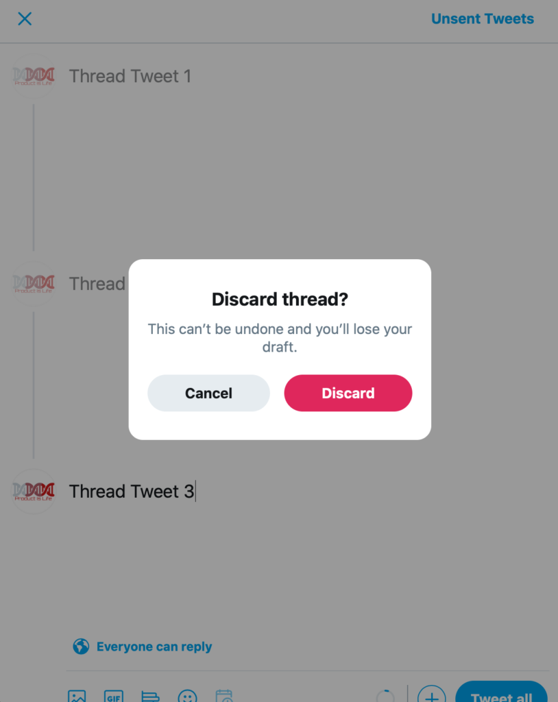
7. Can’t draft a “Thread” on Web
Twitter thread are awesome. They let us share our thoughts and ideas without worrying about the 280 character limit. However, on Twitter Web, you just can’t save/draft a thread while creating. The only two options you get are “Discard” and “Cancel”. It clearly is not a tech challenge as saving/drafting a thread while creating on the Twitter app works perfectly fine.
I have a hypothesis that “Majority of the Twitter threads are created on laptop/desktop rather than phone”. Two arguments in its favor are –
- Threads are usually not instant thoughts that are put out instantly. Users do a lot of research or homework before putting out a thread. We often end up on our laptop/desktop when researching about a topic.
- Despite all the advancements smartphones have witnessed in the past decade, typing on your laptop/desktop is still much more comfortable and faster than tapping the on-screen keyboard on your phone. And since threads involve a lot more typing than usual, it’s fair to assume that users prefer laptop rather than phone for creating Twitter threads.
Still, why Twitter doesn’t allow users to draft a thread on web is a mystery.
8. Weird obsession with “Pink” on Web
Twitter, since the very beginning, has been associated with its famous blue theme. And we like it that way. However, in Twitter Web, the Pink color keeps popping up every now and then. Now, the color preferences may vary from user to user but i think, it’s a totally out of place color scheme and highly annoying. Below are some of the scenarios when this happens –
On discarding a thread, the “Discard” CTA is in pink color
The “Clear all bookmarks” option in the 3 dot menu in bookmarks section is also of pink color

The “Delete” option for a tweet is also of pink color

It appears that Twitter is using pink as their go-to color for negative CTAs like delete, discard, clear all etc.. But still, the color combination can be relooked at.
9. Proximity of “Add another Tweet” and “Tweet” button in Web
In Twitter Web, the “Add another Tweet” + button is dangerously close to the “Tweet” button.
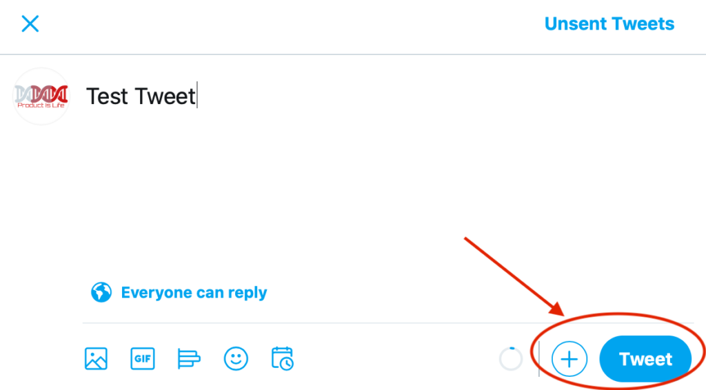
It is very much possible for users to accidentally click on “Tweet” when they wanted to add another tweet to their thread. Twitter already has a bunch of options on the left side of the pop up and “Add another Tweet” option should also have been part of that list, seperate from the main CTA i.e. the “Tweet” button.
Now, if you notice, a lot of the above comments are about Twitter Web user experience and not the app. At times, it feels like Twitter Web and App are two completely isolated teams with no synchronisation or communication between them. Though 80% of the Twitter users are on mobile, still Twitter should not discard their web user experinece so blatantly. We did a similar analysis on the Facebook Web user experience.
Twitter should work on the above mentioned user experience issues. It’ll probably drive more engagement with their users on the platform and help them in the long run.