Instagram is the 6th most popular social network in the world and we spend a good amount of time daily on Instagram. Instagram is often praised for its UX design which has made it a hit among youngsters. However, there are quite a few UX design principles / standards that Instagram breaks regularly. Is this something that differentiates Instagram from the rest or is this a missed opportunity by Instagram? Let’s discuss the 5 User Experience design that Instagram does wrong.

1. Placement of Save / Bookmark icon
Instagram has its “Save” icon at the bottom right of the post.

However, through years of social media experience on multiple platforms, we have been subconsciously programmed to click in the top right to save / bookmark a post. E.g. –
Reddit & 9gag have the save icon on the top right
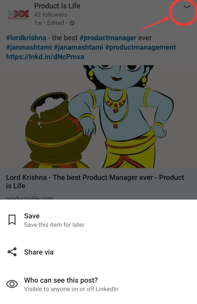
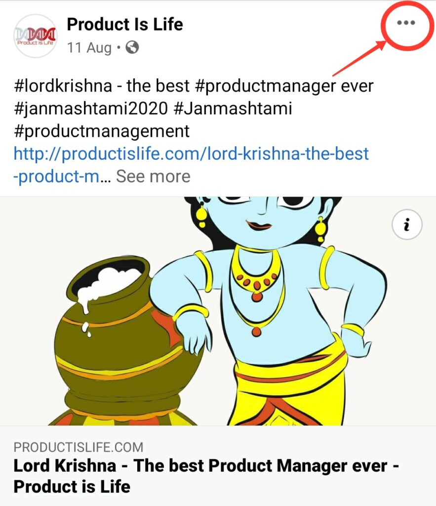
Facebook and LinkedIn are a bit indirect in the sense that we have to go through a 3 dot menu or dropdown arrow icon to save a post. But still, the placement of the 3 dot menu or the dropdown arrow is at the top right. So if you have to save a post on Facebook or LinkedIn, you intuitively look for a CTA in the top right.
LinkedIn Save Icon
Facebook Save Icon
There may not be a fixed standard for where to place the “Save” button. But, in my opinion, the more intuitive (subconscious) a social media platform is, the better it is. By deviating from the standard, Instagram is consciously introducing a disconnect in the user experience.
2. Placement of Timestamp
Instagram places the timestamp of a post at the very bottom (even after the comment box).
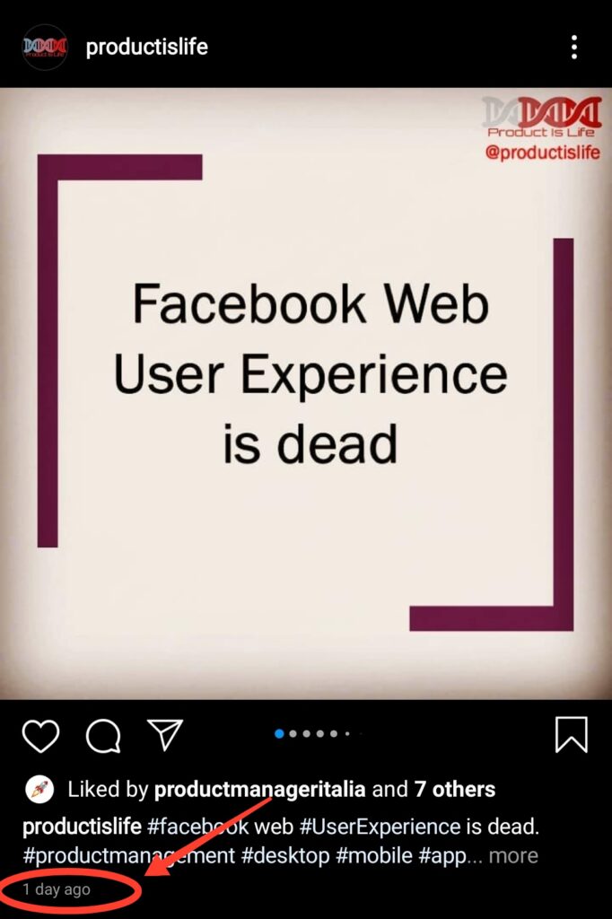
Again, this is a deviation from the unwritten rules of social media. Almost every other social media platform has the timestamp right at the top.
Facebook Timestamp

Twitter Timestamp
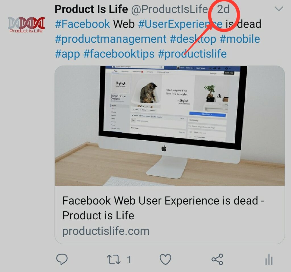
LinkedIn Timestamp
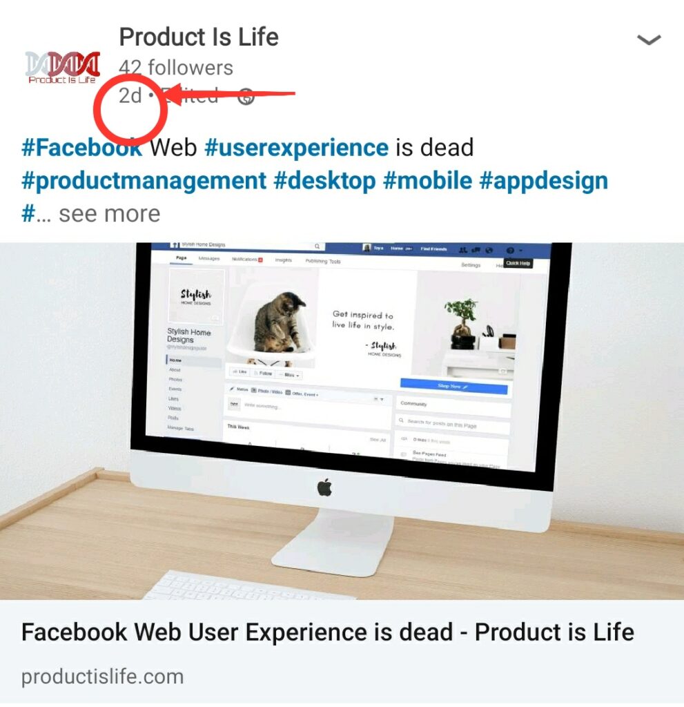
This behaviour, I think is a UX mistake by Instagram and they should also start showing the timestamp at the top.
3. “Activity” icon is same as “Like” icon
Instagram uses the same icon for “Like” and “Activity” (or Notifications).

This also, I believe, is a UX gap. I may even exaggerate a little and say it’s a bug. The “Activity” section gives info about “Like”, “Comment” and “New Followers”. So using the “Like” icon for “Activity” is not just confusing, it’s wrong. Same icon for 2 different workflows is just weird.
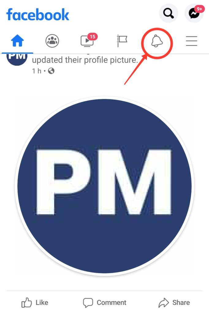
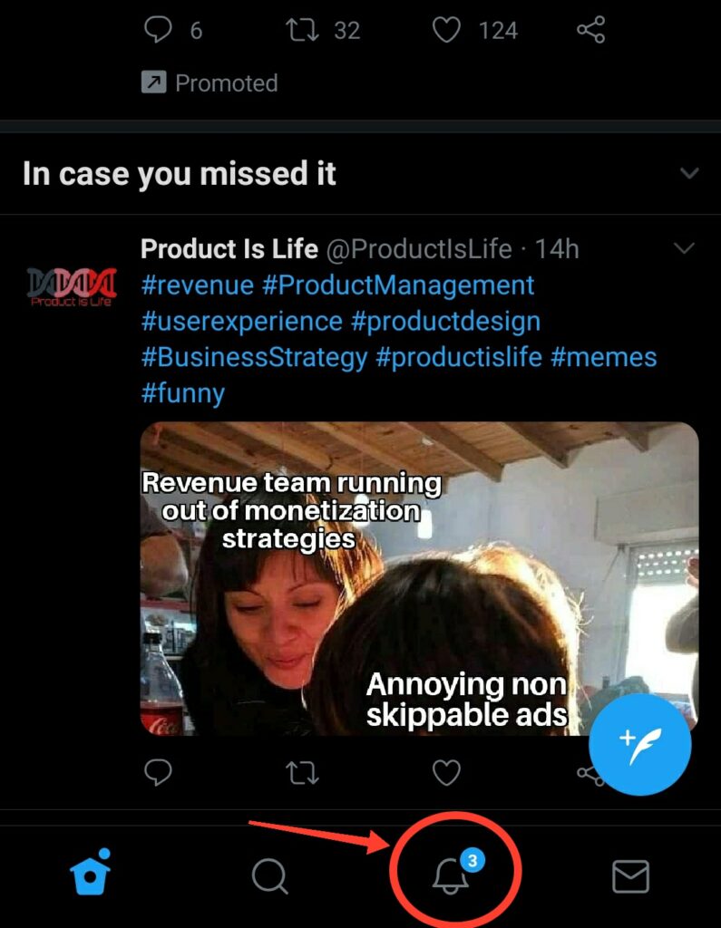
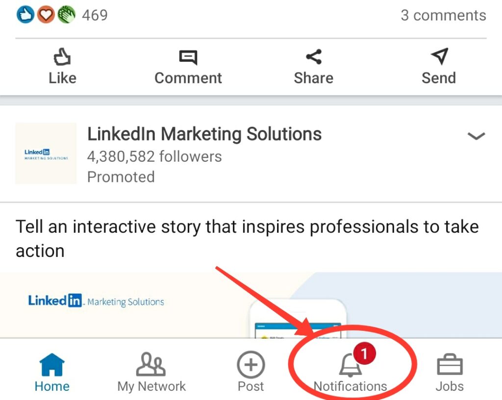
You don’t have to do something stupid just to be different. The ubiquitous “bell” icon has long ago won the de facto status as the “notification” icon. Twitter, Facebook, LinkedIn, Youtube all subscribe to the same philosophy.
Facebook Notifications Icon
Twitter Notifications Icon
LinkedIn Notifications Icon
4. Comment icon design
This is a bit tricky and the most subjective of all. When you think of a comment icon, what is the first design that comes to your mind?

For me, the “Left to Right” is the more intuitive one. Even a quick Google search of the “comment icon” confirms the same.
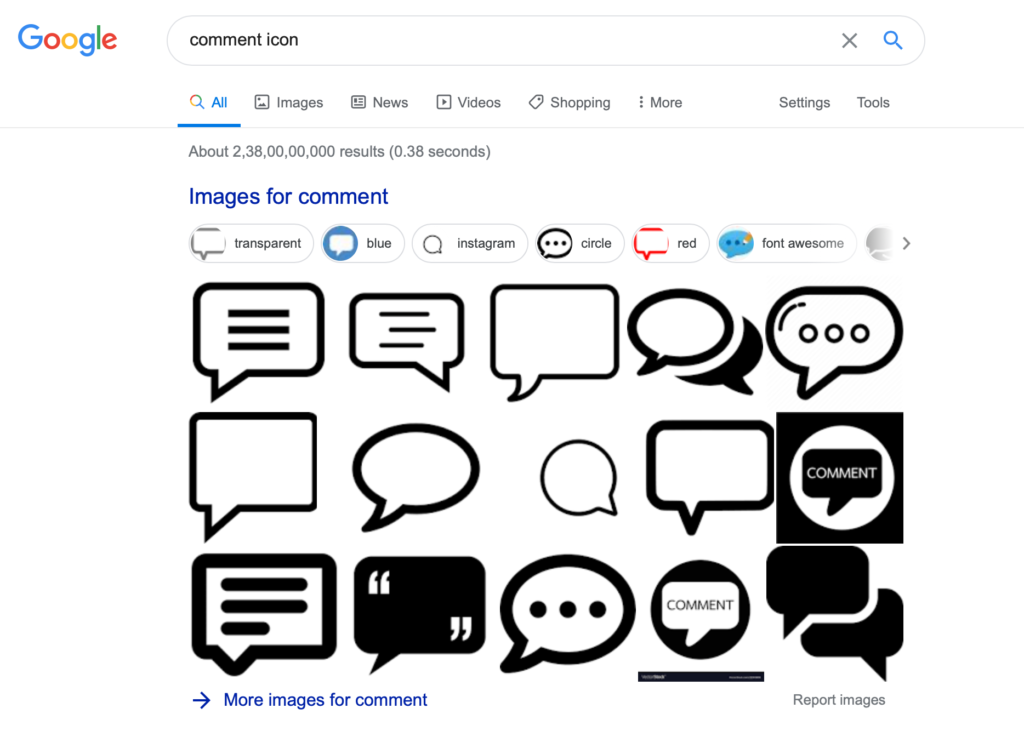
Of the top 15 search results, 12 have the comment icon as “Left to Right”.
However, Instagram uses a “Right to left” comment icon.

Is that too much of a deviation from the standard? Or is there even a standard comment icon design in the first place? When I consciously researched on multiple platforms, I realised that there is no one consensus on the comment icon design among the different social media platforms.
Facebook sticks to the standard “Left to Right” comment icon.

LinkedIn uses a “Right to Left” comment icon, similar to Instagram.

Twitter & Reddit have taken a more neutral approach of starting the comment icon from the middle.
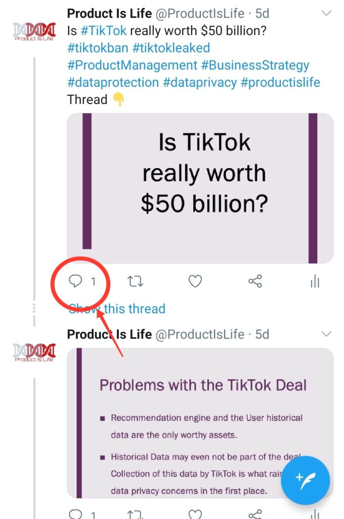
Youtube, on the other hand, has no comment icon at all. They decided to just go ahead with the word “Comment”.
5. Clicking on a user image icon in the feed shows the Stories instead of user profile
If I haven’t seen the stories of a user, then clicking on the user image icon from the Instagram feed shows me their stories rather than their profile info. However, usually on the social media platforms clicking on anybody’s profile icon shows their profile rather than stories.
Facebook, Twitter & Youtube are few other social media platforms that offer the feature of Stories (or “Fleet” as Twitter calls it). All these platforms adhere to the ideology of showing a user profile on clicking the user profile icon.
On a side note, Instagram seems to be a bit more obsessed with stories. Even in the feed there is a more than the required push to engage with the stories. A dedicated card of “Recent Stories” keeps showing up every now and then in the feed. But, that is a discussion topic for some other time.
P.S. Since we are talking about user experience, do checkout our UX analysis of Facebook and Gmail.
Pingback: Top 9 User Experience (UX) design Twitter does wrong - Product is Life